
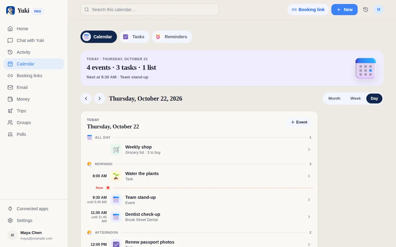
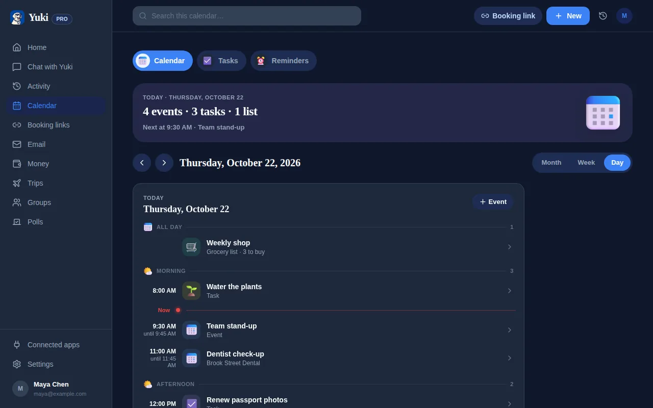
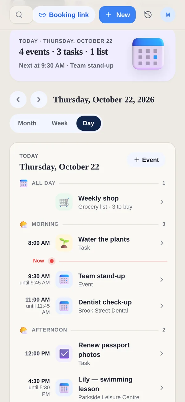
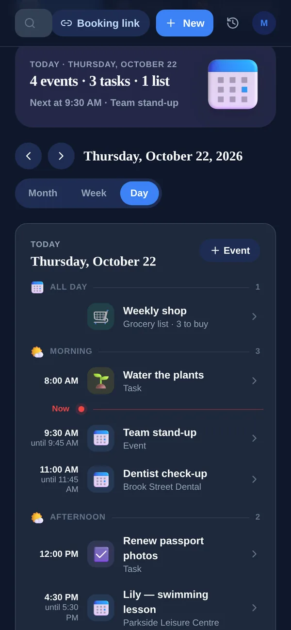
Tiimo and Yuki both want planning to feel lighter, and they start from different places. Tiimo starts from your day: you put in what you need to do, and it lays it out as a visual timeline with a timer to keep you anchored. Yuki starts from your inbox: it reads the Gmail account you connect and turns what is already there into a calendar, trips, bills and expenses, shared with the people you live with when you choose.
Side by side
A “—” means not something we can confirm from Tiimo's site or App Store listing, not that Tiimo lacks it.
| Feature | Yuki | Tiimo |
|---|---|---|
| Built for | Personal and household life admin | Visual daily planning |
| Free plan | Yes, no card | Yes, on iOS and Android |
| Paid plan | /month | Tiimo Pro, monthly or yearly ($54/year on the US App Store) |
| Free trial of the paid plan | 14 days, no card | 7 days, yearly plan only |
| Visual day timeline | Calendar Day view | |
| AI breaks a task into steps | Turns a task into a timed multi-step timer | |
| Focus timer | Multi-step timers | |
| Plans built from your email | Yes, from Gmail on Pro | — |
| Trips, bills, subscriptions and expenses | — | |
| Calendar | Two-way Google Calendar | Apple, Google or Outlook calendars |
| Sharing with family | Groups; everyone keeps their own account | Up to 5 profiles |
| Platforms | iOS, Android & web | iPhone, iPad, Apple Watch, Mac, Android & web |
Where is Tiimo ahead of Yuki?
- The visual timeline. Tiimo turns your schedule into a colour-coded timeline you can follow, with drag-and-drop tasks. Yuki’s Day view is a list in time order.
- Planning help. Tiimo’s AI co-planner turns what you type or say into steps with time estimates and groups your to-dos by priority.
- Staying on track. A focus timer, widgets on the home and lock screen, and an Apple Watch app keep the next thing in view. Yuki has no Apple Watch app.
- Reflection. Mood check-ins and a place to reflect on your day are built in, along with courses and a community hub.
Where does Yuki fit differently?
- Plans that come from your inbox. With Pro, Yuki goes through your Gmail and turns confirmations into trips, bills and renewals into tracked subscriptions, and invites into calendar events, so less has to be typed in.
- The life admin around the day: expenses from receipts, subscriptions with a heads-up before renewal, and costs split with other people.
- Shared life with other people. Groups for a partner, family, flatmates or a trip, with a shared calendar, tasks, grocery lists and expenses, while each person keeps a private account.
- You approve first. Yuki asks before it sends an email or acts for you.
Choose Yuki if…
- Your Gmail is full of bookings, bills and invites that should become a calendar, trips and expenses
- You share plans, lists and costs with a partner, family or flatmates
- You want a free plan on the web as well as the phone
Choose Tiimo if…
- You want to see your day as a visual timeline, with a timer that keeps you anchored
- You want AI to break a task into steps with time estimates
- You want widgets, mood check-ins and an Apple Watch app
Who is Tiimo for?
Tiimo’s App Store listing calls it “your AI planning partner that simplifies executive function, focus and productivity” and a “neurodivergent-friendly planner”, and its FAQ describes “a visual daily planner designed to support neurodivergent brains, and helpful for anyone who thrives with structure, reminders, and flexibility”. It is made by tiimo ApS in Copenhagen. Tiimo is for laying out one person’s day so it is easy to follow; Yuki is for the plans that arrive by email and the people you share them with.
Can I use Tiimo and Yuki together?
Yes. Tiimo can sync with Google Calendar. If Yuki sends your events to Google Calendar, the bookings and appointments it finds in your email can show up in Tiimo, and you plan the rest of the day around them there.
Does Yuki have a calmer, low-stimulation mode?
Yes: Calm mode, designed with ADHD, OCD and autism in mind. One switch in Settings, under Appearance, turns off animations and moving parts, confetti and celebrations, and streaks in group challenges. Home’s summary uses plain words instead of counts and badges and shows only the essential banners, nothing pops up on its own and there are no vibrations. It is off until you turn it on, and the choice follows your account on the phone and the web.